Typography

Typography That
Reflects Valpo’s Identity
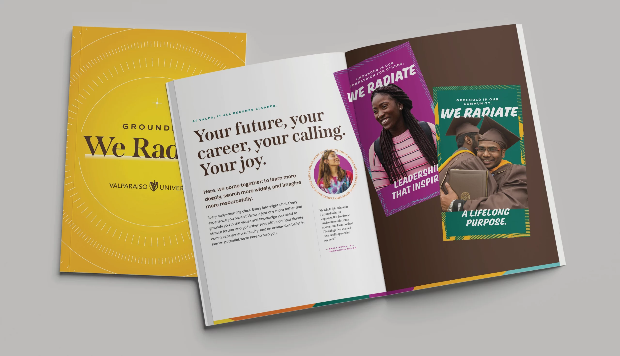
Our typography is designed to reflect Valpo as a whole: a harmonious blend of traditional and modern aesthetics. Our goal is to evoke a sense of heritage and fresh, forward-thinking energy through subtle design elements and classic letterforms. Consider typography an extension of the Valparaiso University personality. It conveys moods, tones, and meanings, and each typeface serves a specific purpose.
In section 4 of our brand guidelines, you can find additional information about our typography, like a typesetting example and when and how to use each typeface. For downloadable font files, please contact
When brand fonts are not available, please use Verdana and Libre Baskerville on the Google ecosystem.
Find What You Need
Explore More
Questions? We have answers.
Use this AI-powered search to easily and quickly find any information that’s available on this website.


